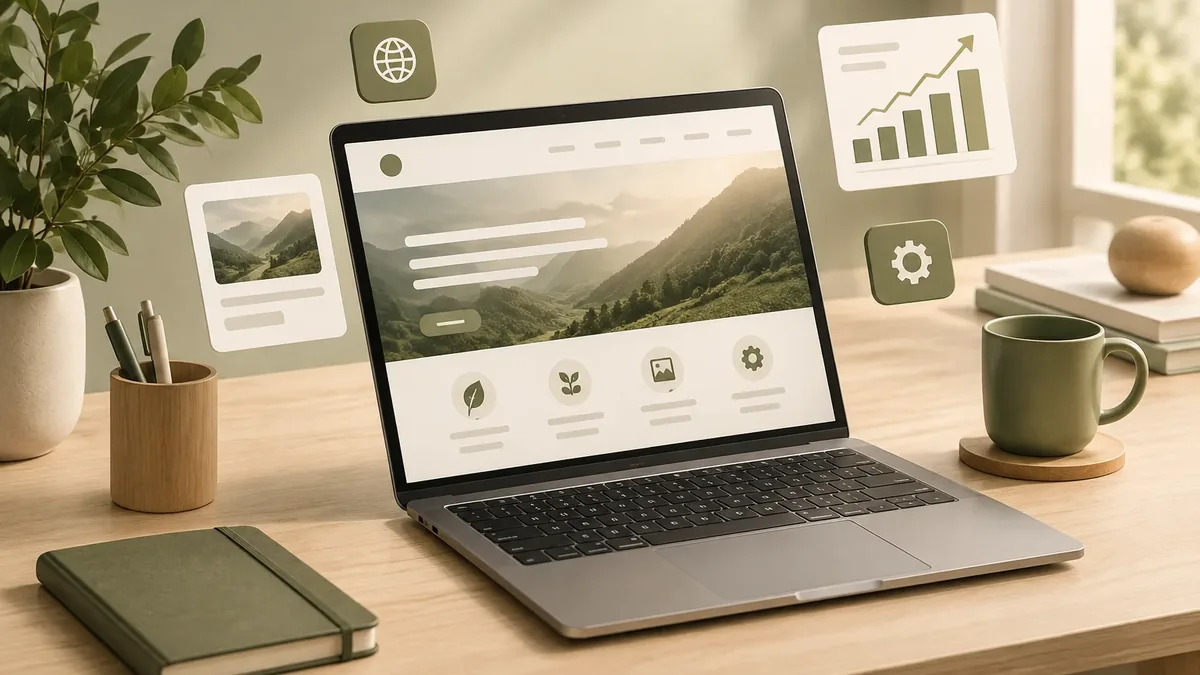

There’s no foolproof recipe for a perfect website. Anyone who promises you one is exaggerating. What does exist is a set of effective web design fundamentals that, applied with good judgment, separate the sites that bring in customers from the ones that just take up space online.
We’ve grouped them into six principles. None of them depends on a trend: they worked ten years ago and they still work, with the adjustments today’s users demand.
Principle 1: clarity before creativity
You never get a second chance to make a first impression. If visitors can't tell within a few seconds who you are, what you do, and what they can do on your site, they go back to Google and click on a competitor.
- A headline that says what you offer, not an abstract slogan.
- A subheading that explains who it’s for and what the benefit is.
- One main button with a specific action: “Get a quote for my project,” “Book an appointment.”
- A short menu, with labels your customers understand.
Principle 2: design for your users, not your own taste
It’s easy to fall in love with a style and forget who the site is for. The right question isn’t “Do I like it?” but “Does it work for my customer?” A law firm needs restraint and trustworthiness. A youth-oriented brand can afford more color and motion. An industrial distributor needs spec sheets that are easy to find.
Before you design, look at the websites in your industry, identify what they do well and where they fall short, and talk to a few customers about what they’re looking for. Planning away from the screen, with pen and paper, is still one of the best ways to start.
Principle 3: make it usable for everyone
Back then, the advice was not to overdo Flash or heavy animations because not everyone had up-to-date devices. The principle still holds, in different forms:
| Starting point | What it means today |
|---|---|
| Mobile-first design | The site is designed mobile-first, since that's where most visits come from. |
| Compatibility | Works the same in Chrome, Safari, Edge, and Firefox, and on mid-range phones. |
| Speed | Loads fast even on mobile data. Google measures this with Core Web Vitals. |
| Accessibility | Good contrast, alt text, keyboard navigation, and readable sizes, following WCAG guidelines. |
Accessibility isn’t a minor detail: it expands your audience and improves the experience for everyone. If you want to go further, take a look at our accessible website development service. And if your site is slow, start with website speed optimization.
Principle 4: visual hierarchy and easy-to-scan content
Online, almost nobody reads straight through: they scan. Effective design guides the eye with clear headings, short paragraphs, lists, white space, and contrast that highlights what matters. The most important content goes at the top and on the left, because that’s how most people who read left to right scan a screen.
Key point: If everything on the page is highlighted, nothing is. Save your accent color for buttons and key information.
Principle 5: calls to action and trust
Every page should end with a next step. A visitor who read your entire service page and can’t find how to contact you is a lost sale. Pair your calls to action with trust signals nearby: real reviews, case studies, guarantees, and visible contact information.
- Sticky WhatsApp button on mobile.
- A short form on service pages.
- A click-to-call phone number in the header.
- Reviews near the contact buttons.
This approach is at the heart of our conversion-focused web design service.
Principle 6: measure, learn, and improve
An effective web presence doesn’t end on launch day. That’s where it starts. With Google Analytics 4 and Search Console, you know which pages people visit, which searches bring them in, and where they drop off. With heat map tools, you see where they click and how far they scroll.
- Define what counts as a conversion: a submitted form, a click to WhatsApp, a purchase.
- Set up tracking for those actions.
- Review the data every month.
- Change one thing at a time and compare results.
- Repeat. Small improvements add up and make the difference.
What isn’t a fundamental, even if it looks like one
Visual trends change every year and they’re worth knowing, but they don’t replace the fundamentals. A trendy effect can add value if it respects speed and clarity. To see what’s current, check out this year’s web design trends. And if you’re building your site from scratch, use our list of must-have content.
Mistakes that sabotage web design
The same problems come up again and again in the audits we run on business websites. None of them seems serious on its own, but together they drive customers away:
- Auto-rotating homepage sliders: they change before anyone can read them and slow down page load.
- Text inside images: Google can't read it well, and on mobile it becomes illegible.
- Pop-ups on arrival: they interrupt visitors before they even know what you offer.
- Buttons that don’t look like buttons: if they don’t stand out, nobody clicks.
- Outdated information: old phone numbers, expired promotions, or years-old news make a site look abandoned.
- Too many fonts and colors: the site loses consistency and the brand gets diluted.
Consistency is a fundamental too. Your website should look and sound like your brand everywhere: the same colors, the same typography, the same tone in the copy. That consistency, combined with useful content, is what builds a web presence people remember. If you need an objective assessment, a technical audit of your website shows you what to fix first.
Does your site look good but fail to generate leads? Let’s talk and review together which fundamentals it’s missing.
Talk to an advisor